How Designing with the Right Colour Can Create Equal Learning Opportunities
August 18, 2021

When it comes to designing for higher education learning environments, a well-executed colour palette can enhance the absorption of information & facilitate the thinking process. The right colour, correct selection, and proper placement can all play a significant role in the feelings, attention, and behaviour of learning environments – as well as its in-between places.
“Every space is a learning space in higher education learning environments, and colour plays an interesting role for the in-between places that are not the classroom or the learning commons,” says Brendon Devenish, Sales Manager for CDI Spaces. He adds, “Here you find lounges, hallways, and other informal areas that can and should be used for much more than just a way for students to move from point A to B.”
“We like to challenge our clients and communities to use colour in creative and unconventional ways in these areas, such as creating themed sensory corners or adding bright plug and play furniture.”
Opposite Sides of the Colour Wheel
Research suggests that people with high cognitive course loads, from programmers to medical students, can benefit from spaces that play it cool or create subtle energy – through testing and experimenting with opposite sides of the colour wheel.
So, which blue, yellow, green, purple, red or neutral colour is right to create equal learning experiences in higher education learning environments? Here are some colour choices to promote higher levels of thought without creating a sense of detachment and coldness.
Calm and Creativity
Blue is ideal as a relaxing and calming colour for learning environments that are intensely challenging. In lighter shades, blue can identify as friendly versus darker shades that can appear a little more somber.
Subtle Energy
Yellows complement those in-between places with subtle energy when used as fixed colours, such as lounging chairs or vibrant accents on tables. As a lively and exciting colour, it also plays a dual role in cold Canadian winters by encouraging positive emotions associated with the sun and summertime.
Balance Neutrals
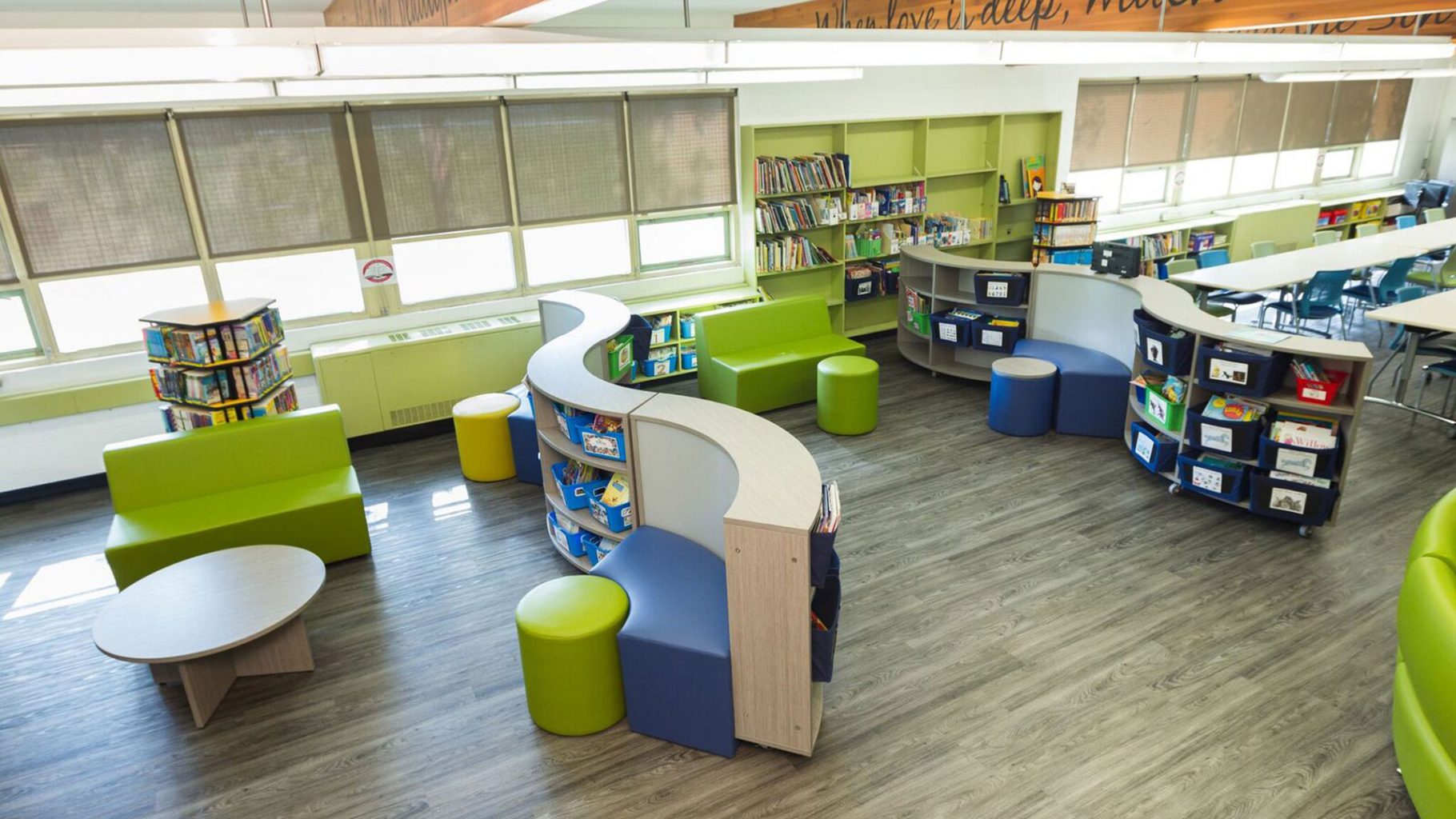
Mix neutral colours such as tans, creams or blacks and greys, with undertones of green – the natural colour of balance – and set the stage for improving concentration, efficiency, and focus. One of the easiest colours on the eyes, green, also mimics forest foliage and tends to skew more neutral than reds, blues, and purples.
Colourful Spaces
Planning and designing with the right colour palette in mind is a renowned best practice for positively affecting feelings, attention, and behaviour of people in higher education learning environments. Have questions about how we can help you with the right colour choices? Try our 3D approach to discover, design, and deliver.


