If there’s scientific evidence showing this is true (and there is), then surely color can impact other areas of our life as well. Take, for example, mood and workplace productivity. It isn’t hard to imagine that these, too, could benefit from exposure to the right color. So, what then, is the right color?
As with anything in life, what’s ideal in one situation may be counterproductive in another. And color is no exception.
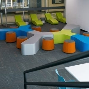
Color influences productivity, creativity, and mood at work
Angela Wright, an expert on color, has been researching the impact it has on behavior since the seventies. Her research challenges the thought that because people’s response to color is subjective, it must also be unpredictable. However, she explains, “When the study of color harmony is combined with the science of psychology, reactions can be predicted with startling accuracy.”
She uses the example of a fly in the home to make her point: “If it is black or navy blue, we will probably find it a minor irritation, but if it has yellow stripes our reaction will be different – most of us will recoil.”
This is great news in terms of office design. No, we don’t suggest releasing bumblebees into the office to stimulate employee action. However, by intentionally choosing certain colors in different spaces, you can elicit a specific response.
Now that we’ve covered some of the science, let’s get back to the colors themselves. But first, keep this in mind: it’s not just the color that makes an impact; the intensity of each is also important. So, regardless of the hue you opt for in your office design, remember that high intensity will stimulate, while low intensity will soothe.
Blue is an intellectual color. It represents trust, logic, communication, and efficiency. Use blue as the primary color in office areas that require focus and mental strain.
Red is a physical color. It represents courage, strength, and excitement. It’s a great color to use in areas of the workplace that demand physical exertion.
Yellow is the emotional color. It represents creativity, friendliness, optimism, and confidence. Incorporate yellow when you want to stimulate positivity, creativity and happiness.
Green provides balance. It represents harmony, nature, and restoration. Green proves to be a great color in offices that require people to work long hours, since it’s the easiest color on the eyes (requiring no adjustment). It’s also a great color to use anytime a sense of balance is top priority, which is why it’s commonly found in medical offices.
Purple is often associated with spirituality or luxury. It can promote deep contemplation or luxury, but should be used carefully, as too much (or the wrong tone) can have an opposite effect.
Orange blends the physical (red) and emotional (yellow), creating a sense of comfort. It is often associated with food and warmth, and is therefore a natural choice in kitchens. When used appropriately, it is also a fu n color, making it an option for a casual office lounge.
Grey often represents neutrality. We commonly see it used in offices attempting to look sleek or modern. However, when used inappropriately, it suggests a lack of confidence and can stimulate a depressing mood. As a result, be cautious when incorporating grey in certain spaces.